#GovJam: Weekend Web Challenge with DIA
Earlier this year, the Department of Internal Affairs approached us to bring in some fresh thinking to the govt.nz website.Their goals are to help people
- receive information and seamless public services they need in the way that's best for them
- to trust public services supported by a unified government approach
We were stoked at the chance to give students an opportunity to work on a real live website, to help people access government services, and to practice their web design and development skills in a "real life" situation.We only had space for 25 participants, and with close to 70 students applying for spots, willing to give up their weekend to work on something cool... it was tough to pick the final participants! Needless to say, we have a bunch of students keen to give this a crack in future, so please let us know if you have a web project in need of some fresh thinking.
The Web Weekend organising team
We worked alongside the Government Information Services team at DIA, who were our "product owners" and had representatives on site to host and support the teams through the weekend.The Summer of Tech crew worked alongside Anna, Ants & Jen from EXP Events to ensure awesome facilitation and support throughout the weekend.And our amazing SoT volunteer mentor community stepped up! Thanks to Chris, Rupert, Maia, Neve, Tim R & Tim M for helping out on Saturday with agile, design, data science & innovation/ inspiration! On Sunday, Jacob, Marcus, Craig, Nate & James joined us for additional design & front end development support.
The participants
We had space 15 web developer and 10 design students (+ recent grads) - it was tough choosing, there was a long waitlist for this event! We were aiming for a diverse range of skills, backgrounds & perspectives, to give DIA some genuinely fresh thoughts in response to their challenge questions. We had participants from Yoobee, Massey's COCA Design School, Whitireia, Victoria University, Enspiral Dev Academy, Weltec, Waikato University, and the Wellington ICT Graduate School. We had a range of ages, life experience, work experience, skill and country of origin.One of the biggest benefits for students participating in events like this is the opportunity to work with people with different backgrounds and skill-sets. When you do team projects at uni, everyone is from the same stage and discipline, which is very different to real world work environments.This led to some of the biggest challenges: communication & team dynamics, but also some of the biggest lessons over the weekend! And excellent material to discuss in future job interviews.
The challenge
We worked through a service design process, with Maia & Neve from Alphero getting everyone's Design Thinking mojo on with a quick session on Saturday morning. To familiarise participants with the topic, teams were asked to discover things on the govt.nz website, then they were asked find the same information on websites from other jurisdictions (e.g. Canada, UK, Finland...) This helped them to identify differences in the user experience and technology innovations.First up, a deep dive into empathy with the DIA team posing some real questions from people trying to access :
- how do I get help with funding my hearing aid?
- how do I find my birth parents if I was adopted in the 1980s?
- can I get help to pay my rates?
- how do I check if that speeding ticket was REALLY mine?
- when can I apply for NZ citizenship?
As we worked through the stages of empathising, defining & ideating on Saturday, the teams followed an agile approach, with regular stand ups and check ins to make sure everyone was communicating and working well together. Ideas were flowing!! DIA encouraged teams to think broadly and not restrict their ideas to websites, this led to some really interesting concepts and discussions.From empathy & ideation, on Sunday we moved through to prototyping, testing and getting ready to present solutions to the DIA team. Our tireless design mentor Jacob came back for more design support, and he brought along a couple more Trade Me colleagues Marcus & Craig to help with front end/web development mentoring. The awesome Nate & James from Alphero came along for even MORE dev support (thanks Sunday mentor crew!!)Because of the tight timeframe, solutions had to be very focused. Some of the teams went outside to do REAL LIFE user testing, talking to supermarket customers about their preferences for accessing government information and services.
The results
At 4pm it was time for presentations! The 5 teams shared their solutions and prototypes with a panel of DIA people.
Team 2Down
The problem they're trying to solve:
Providing government service information in a more accessible, simplified, concise and personalised manner to people who are otherwise dismayed by visiting government websites for accessing information
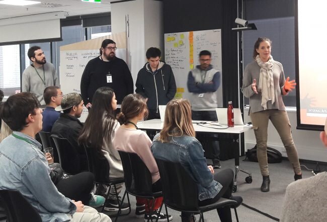 Team 2Down identified a user persona who needs to access government health services, but doesn't love technology. Sid & Danton went OUTSIDE to test their wireframes on members of the public - Sunday morning supermarket shoppers! The feedback was strong: people don't want a website, they just want to talk to someone who can solve their problem NOW.For their solution, the team focused on front end development, and their biggest challenge was building a data model with all possible services (in such a short timeframe). They considered accessibility issues and the best ways to provide a single portal for users to find the information and services they need.
Team Treehouse
Want to increase the friendliness, clarity, and facilitation of government resources. Their ideation phase produced epic potential solutions: before they landed on a website solution, they considered a communal tree house, pamphlets, kiosks & more!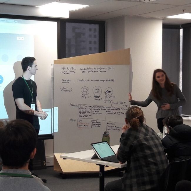 And here's the demo! Their focus was on clean and consolidated interaction. Team Tree House designed for a human, friendly and comfortable interaction. Key features include being able to choose multiple services, and to see where you've come from (previous pages)
 Team Tree House's biggest lesson from the weekend was about teamwork! They had great energy and skills and the mix of developers & designers on the team enabled everyone to appreciate each other's workflow.
Team Olly
Focused on people in need of financial aid, but don't know where to look. Their user research discovered that the current state was confusing, involved lots of clicks, and left the user wanting all the information in one place.They built "The Guess-Timator", a smart calculator to help people understand the financial support available to them, through interacting with the chatbot "Olly", it's a form that doesn't feel like a form!
 Designers Ella & Lauren explained their process - they wanted to blend an informal, friendly interface with the need to ensure the experience was trustworthy, that users knew it was a correct interpretation of government information.
 The DIA panel were impressed: " This is a fantastic model, and it could apply to a lot of different contexts"
Team Sherry
Focused on creating an intuitive UX, for their target audience of people looking into their NZ superannuation entitlements and the process to apply.Their user persona is Bob: he feels pain when information is repeated, is confused by all the different websites, and doesn't know how long it will take. Bob wants a HELP button!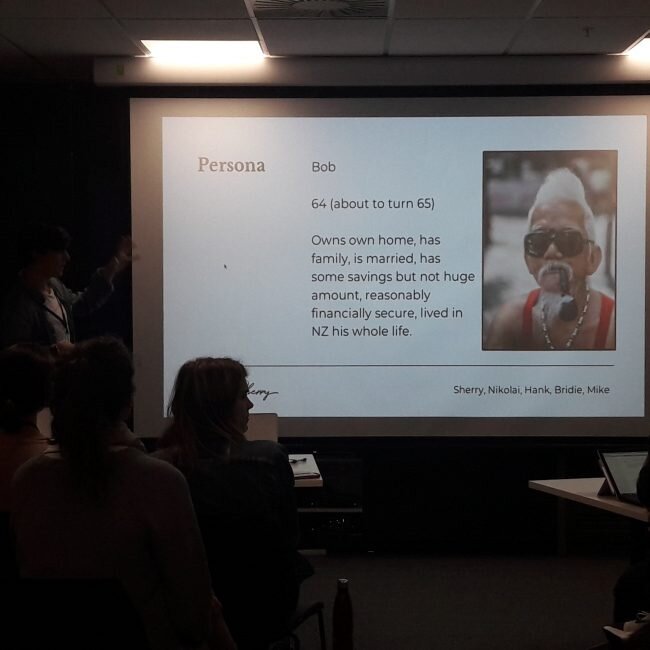 Team Sherry identified some more challenges for Bob and other seekers of Superannuation information:
- there is a LOT of information, users need a way to find out what's relevant to their situation
- there's no "help" button, users need to know what to do if they get stuck
- there's no way to tell how far through the process you are - a progress bar would by handy
They built... Govy! A chat assistant to guide you through: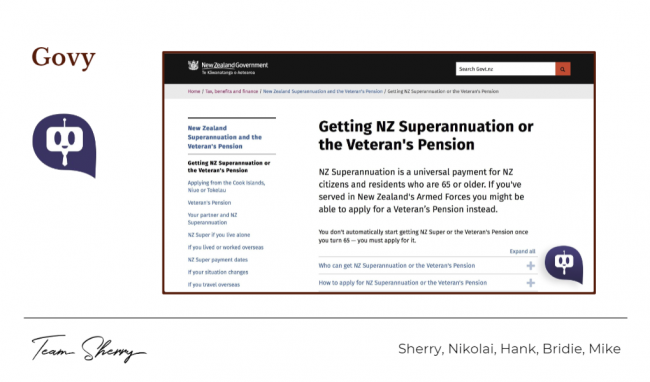 Govy acts as a helper if you are confused or need help, and acts as an “inspect source” function if you're confused about certain section on the page. Govy can connect you to a human if needed!
Team Dora
...built the Search Bar Explorer! They honed in on improving the "search" process flow, and implemented small but meaningful improvements for accessibility.Their users included "Chris" who received a speeding ticket, but swears it wasn't him (probably his teenager!), and a Japanese visitor wanting to information about extending their visa. They had lots of suggestions for accessibility. Darren demo-ed an audio interface that he'd built during the weekend. They would love to see a translation button where you could see the govt.nz website in Te Reo, other common visitor languages, and an easy way to switch to a bigger font.
The Feedback
 Our DIA hosts were very impressed with all the teams, they said
Every team has brought new insights that we can use
It was a tough choice, but overall honours for the weekend went to Team Dora, with the panel commenting that they loved the way they'd combined "filter" and "search", and that their focus on accessibility was excellent.Honourable mention to Team Olly for their user-friendly chat bot!Thanks to EVERYONE who made the Web Weekend possible, it was a blast, with so much learning and creating and teamwork!!More photos from the event in the Facebook album here.
